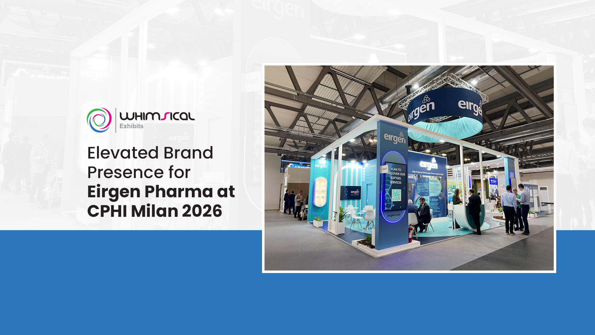
At the CPHI Worldwide Milan 2026 show, Eirgen Pharma showcased its brand using an eye-catching 63 sqm exhibit stand for communicating their message and initiating interactions with the delegates.
In this particular project, we have incorporated powerful branding, well lit exhibits and well-defined visitor spaces to create a stand which is both visually attractive as well as functional in terms of the utilization of the space.
The outcome was an effective branded exhibition environment providing the visitors with multiple ways of interacting with Eirgen Pharma.
The Challenge: Standing Out in a Busy Exhibition Hall
Pharmaceutical exhibitions require the attendance of manufacturers, suppliers, and industry people; hence, there is a need for effective communication of the brand. The exhibition stand must be attractive from afar and also provide information and comfortable places for business discussions.
For Eirgen Pharma, the 63 sqm area had to cater for a number of objectives such as:
- Creating an identifiable brand presence in a busy trade show environment.
- Communicating company and product details in a clear manner.
- Utilising lighting and digital media to attract people to the message.
- Creating room for face-to-face interaction while ensuring the stand does not seem crowded.
These were incorporated into the design by creating a strategic layout, using effective brand signage and creating communication zones.
Exhibition Stand Design: Strong Branding and Open Architecture
A Circular Overhead Sign for Brand Visibility
One of the most notable elements of the stand was the big overhead circular sign carrying the branding of Eirgen Pharma. It was hung up above the structure and helped to create visibility within the entire exhibit hall.
The blue color scheme, along with white lettering, and turquoise lighting in the lower part helped to create a distinct visual identity. In addition, the overhead element was combined with the lower level branding of the stand.
A White Frame That Defines the Space
The white architectural structure provided a clean frame around the stand, providing a distinct visual edge without enclosing the area. The open architecture enabled visitors to look through into the stand while standing in the aisles around the area.
The frame provided unity to the different sections of the exhibit by establishing an architectural language that was used throughout the display. This, together with the use of blue and turquoise colors of the brand, created a modern environment for the exhibition suitable for pharmaceutical industry exhibitions.
Illuminated Graphics and Digital Displays
Lighting formed a significant part of the visual communication at the stand. Selected parts were illuminated by accent blue lighting and illuminated brand panels. The stand’s walls contained information about the company and its products.
Also, digital screens allowed the visitors to get acquainted with more information through their graphic interface along with the printed one. A special screen with a QR code suggested scanning the code and visiting information about the animal health products offered by Eirgen Pharma online.
Thus, the combination of graphic images, digital screens, and a special interactive zone offered visitors various ways to communicate with the brand.
Making the Most of the 63 sqm Layout
A successful exhibition stand must do more than look distinctive. Its layout needs to support visitor movement, information sharing and business conversations.
We used the available 63 sqm to bring several functions together within one coordinated design.
- Product and company information: Graphic panels with information about the products allowed visitors to discover more about the range of products offered by Eirgen Pharma while walking through the stand.
- Visitor interaction: The QR code panel opened up opportunities for further exploration in a digital format beyond the existing print-based materials.
- Meeting places: Places for discussion and seating allowed the team to interact in a more concentrated way with the visitors. These areas were incorporated into the whole space of the stand and not isolated from the rest of the brand stand.
- Visual continuity: Open frame, lighting of panels, and color scheme allowed zones to be visually linked together while providing different functionality at the same time.
The combination of information, interaction and meeting space made the footprint work across several visitor needs without relying on a single display feature.
Bringing the Stand Design Together
Eirgen Pharma booth incorporated elements of architecture, branding, and functional aspects aimed at visitors. The overhead round sign served as a key element of visual identity, whereas white frame created a boundary, and the lighted panels highlighted the branding aspects.
The communication aspect was supported by the use of digital screens and product information boards, and the presence of integrated seats provided an opportunity for more personal interaction. The blue and turquoise color scheme united all elements of design and provided a cohesive look from the exterior to interior.
This project demonstrates how a carefully coordinated exhibition stand can combine brand visibility, information delivery and business interaction within a 63 sqm space.
Planning a Pharmaceutical Exhibition Stand?
Whimsical Exhibits designs exhibition stands where branding, visitor involvement and effective use of space are combined. Whether you are presenting at CPHI or any other global pharmaceutical trade show, your design needs to represent your company, promote your products and meet your show goals.
Looking for an exhibition stand builder in Milan? We can help you with the design and building of your exhibition stand.